
The Problem: Users need to understand their spending patterns to inform and improve future decisions.
The Goal: Educate users and provide them with a tool that makes tracking their spending simple and easy.

I was the UX Designer and Project Lead for Pocket Book. My responsibilities included UX research, paper and digital wireframes, prototypes, and design.
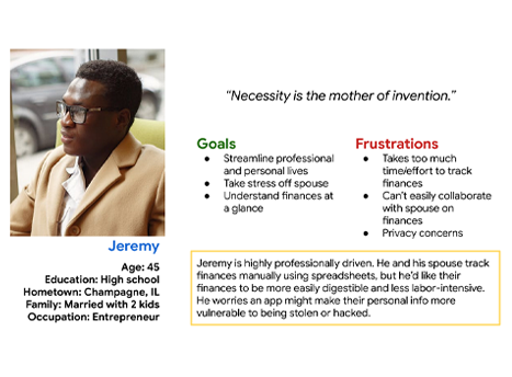
The UX Google Certificate program provides user profiles as a stand-in for user research. I used those profiles to “step into their shoes” and imagine what individuals might need from a budgeting app. I wrote mock interviews, created personas, and generated user journey maps.
The pain points I identified were Time, Effort, Understanding the Information, and Trust in the Product

With a better understanding of what the app needed to do, I began thinking through how the product would be structured. I created a sitemap and drew paper wireframes to experiment with page elements.
Part of Pocket Book’s goal is to educate. I wanted an article hub. I landed on a Featured Article section and cards for previewing other articles and included a search function.

I continued to iterate on the app’s structure via digital wireframing.
My goal for the Articles page was to provide clear information without being overwhelming. Descriptions are kept short, and a handful of options are shown at a time. Users can use the search bar to find something specific or scroll down to simply browse.

I built out each page in the wireframe and linked each button to the intended page to get a feel for how functional the structure was.
At this stage it had four main screens: Home, Articles, Log, and Reports. It also included a form screen where users input transaction information.

I wanted to better understand how users would interact with the app. I conducted an unmoderated usability study with 5 participants, lasting 10-20 minutes each.
Findings: Users needed somewhere to view and update their account information, and the Income vs Payment checkboxes and To/From field were confusing.

With the study participants’ feedback in hand, I added a Profile page and refined the Transaction Form to use a toggle instead of checkboxes.
I also incorporated color, text, icons, and other style elements to match the product’s branding. Creating a sticker sheet simplified this process.

Impact: I received positive feedback regarding use of color and negative space. One participant said, “I’d use that app! It has a friendly vibe.”
What I Learned: The UX course taught a structured and methodical approach to bringing an idea to life. Keeping the user front and center at every stage is a reminder and a lesson I carry forward.
Next Steps: This project requires more refinement, particularly in the area around content. It needs a clearer vision of reports it generates for users, and at least a few articles need to be written. While this was an excellent exercise in UX Design, it is not yet fit for production.
Thank you for taking the time to review this project! Your time and consideration are very appreciated.